Showing posts with label RICARDO. Show all posts

Monday 31 December 2018

Power BI - Introducing dataflows

Case
Power BI recently introduced dataflows. What is it and who should use it?
Power BI dataflows


Solution
According to Microsoft this new addition is for self-service ETL by business annalists and BI professionals. A minor addition from our side: especially business annalists that are skilled with tools like Excel and BI professionals with already a focus on Power BI will probably be very exiting using this new addition. An other group that could benefit of this new feature is the technical application administrator that has a great amount of knowledge of the data model of their application. With dataflows the could do some data preparation for the business annalists

First of all you must have at least a Power BI Pro license and this new preview feature is a Power BI Service-only feature that is not (yet?) available in Power BI Desktop. However you can use the result of a Data Flow which we will show you in the last step.

1) Power BI Service
To create a dataflow, sign in to Power BI Service and go to one of your workspaces, but not My Workspace. Or create a new workspace. Here you will find a new tab called "Dataflows (preview)" and in the Create-menu there is a dataflow option. Click on it to create a new dataflow.

Power BI dataflows - Create new dataflow


2) Add new entities
In this step we will add a source for our dataflow. You can map this data to one of the standard Common Data Model (CDM) entities, but you can also create 'custom' entities that are not mapped. The CDM is a standard model for example for contacts or accounts to which you can map your sources like CRM or SalesForce. It should make it easier for development, but also analytics. In a subsequent post we will explain the CDM.

For this example we will not map to CDM, but create a 'custom' entity. We will use a text file that contains sensor data. We use Azure Blob Storage to store this data, but of course you can also use an internal file share. However then you first need to install the On-premises data gateway.


As told, we choose "Azure Blobs" as data source and next fill in the connection settings. If you have ever used this storage account before then it will remember the account key. Choose your Blob folder which contains the data and now you can transform your data similar to the Power Query Editor in Power BI Desktop.

Power BI dataflows - Create new Entity


3) Edit Query
Just like Power BI Desktop you can do data preparation inside an "Edit Query" mode. This Power Query version does not have the full functionality compared to Power BI Desktop, but the expectation is that it will be extended in the upcoming releases. Some limitations of the current Query Editor in dataflows are: you cannot change the datatypes of the columns or use the 'Group By' function.

Power BI dataflows - Power Query Editor


There are also differences between a Pro license and Premium. In case you are doing some basic transformations like combining two queries (using Merge or Append queries) it will cause the following warning when using a Pro license:
This dataflow contains computed entities, which require Premium to refresh. To enable refresh, upgrade this workspace to Premium capacity.

Power BI dataflows - Pro license vs Premium


More information about the differences between a Pro license and Premium here.

4) Save and use dataflow 
After finishing the data preparation, you must save the new dataflow. Give it a suitable name and after saving, you will be asked to refresh the dataflow or schedule it later. You can set up a "Scheduled refresh" the same way as a dataset.

Power BI dataflow - Save (and schedule refresh)


Open Power BI Desktop, select "Get Data" and now you can use a Dataflow as a source for your report.

Power BI Desktop - Use a dataflow as source


Conclusion
In this post we created our first dataflow, a new (preview) feature of Power BI. Despite we are using the first version which is still lacking of some basic features, it already looks very promising. We expect/hope that the limited Power Query possibilities will soon be aligned with those in Power BI Desktop making this a very powerful tool.

The main benefit of this new addition, is that you don’t have to setup and host a separate ETL tool with possibly complex code. Now everything is integrated in one platform. The disadvantages are, besides the limited Power Query options, the lack of versioning and release management.

Will it replace enterprise ETL with tools like SSIS, Azure Data Factory and Azure Databricks? Probably not in the near future. For now it is still self-service ETL which you could use as a first step to enterprise ETL. However, Microsoft will likely extend this tool in the coming years. Just like they did with Power BI itself. Back in 2014 most people didn’t see that as a serious alternative for reporting.

An alternative route map could be integrating Power BI dataflows within your existing BI platform. You can publish (and refresh) the result of your dataflows to Azure Data Lake and then pick up the data, besides Power BI, with tools as Azure Databricks and Azure Data Factory. We will explain this in a subsequent post next year.

Wednesday 31 October 2018

Power BI Snack: Introducing Data Profiling

Case
When data is not extracted from a cleaned up or validated environment, such as a Data Warehouse or Data Mart, the first step is to analyse and possible clean up the data. How can Power BI help in this?

Data Profiling in Power Query Editor


Solution
The release of October 2018 Desktop update introduced a new (preview) feature that can profiling the data in the Power Query Editor. With this, you can do some quick analysis over your data and you can easily identify errors and empty values in a column.

For this blog post we use sample data from WideWorldImporters. We have saved the data in a CSV file, because it is more common to do this kind of analyses when you load raw data from Text or CSV files into your Power BI Model instead of using validated data from a star schema in a Data Mart.

Apply data profiling in Power BI
Because it is a preview feature, we have to turn this feature on. Go to "File - Options and settings - Options - Preview features" and select Enable column profiling.

Power BI Desktop - Enable Preview feature


Open the Power Query Editor and load your data. In our case it is a CSV file that contains raw data about sales orders. Go to the "View" tab and select Column quality. With this option you can see whether your data contains errors or empty values, also known as "null" values.

Power BI Desktop - Column quality in Power Query Editor


Besides this, you can also view the total of unique and distinct values. Go to the "View" tab and select Column distribution. Unique values indicates how many values occur only once and distinct values means how many different values there are in the specific column. Now the Query Editor will also recommend to do a quick fix if you want, for example remove the duplicate values in a column.

Power BI Desktop - Column distribution in Power Query Editor


Note:
Be aware of the fact that column profiling is only based on top 1000 rows (preview results of the query).

Conclusion
In this post you saw a new feature called "Data Profiling". It is a good start and useful to use this for doing some quick analyses over your data. Note that this feature is in preview.

The program team of Power BI has announced to add more capabilities for data profiling, so we are very curious about what this will bring even more in the future.

Wednesday 29 August 2018

Power Apps: Introduce Power Apps for Power BI

Case
With PowerApps, Microsoft brought a new element to the existing world of reporting and dashboarding inside the Microsoft BI stack. For example, you can connect and customize your data using PowerApps. How does this work and how can you use PowerApps inside Power BI?

Power BI Marketplace - PowerApps custom visual


Solution
Important to know is that Microsoft PowerApps is part of Office 365. In case your organization does not have an Office 365 licence, PowerApps will cost 7 or 40 dollar per user per month. With a license, you can start building your own apps. There are more features available for an additional cost. More details about pricing here.

In this post we want to show you how you can connect to your data and store new data in an Azure SQL Database using PowerApps. For this example, you can give as Sales Employee approval (or not) on the report. This all happens in a Power BI dashboard using PowerApps.

1) Create new PowerApp
We will build the PowerApp using the Power BI Desktop and service. First, you have to create a new report in Power BI Desktop and add the PowerApps custom visual to the report. Choose PowerApps from the marketplace. Notice that this visual is still in Preview.

Power BI Desktop - Add PowerApps custom visual


For our example, we will use data from WideWorldImportersDW (Azure SQL Database) and import the "Employee" dimension and "Sales" fact table. We have implemented a number of transformations to keep only sales employees and created a 'Employee Full Name' column with values like 'Schuurman, Ricardo'. We choose the columns 'Employee Full Name' and 'Profit' in the PowerApps custom visual.

After you have published your report and opened it in the Power BI service, you will see the option Create new. You will be redirected to the development portal of PowerApps.

Power BI Service - Create new PowerApp using custom visual

Note:
When you create a new PowerApp using the Power BI service, a new dataset for the Power BI data will automatically be created with the name "'PowerBIIntegration'.Data".

2) Build PowerApp
Once you are in the development portal, you can start building your app. In a next post we will fine tune the app and explain and show you several elements of the PowerApp.

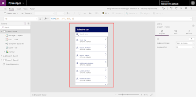
PowerApps Studio - Developing the PowerApp


Important to know is that we have created a new table in WideWorldImportersDW, called "SalesApproval".

USE [WideWorldImportersDW]

CREATE TABLE [PowerBI].[SalesApproval](
 [SalesApprovalKey] [int] IDENTITY(1,1) NOT NULL,
 [EmployeeFullName] [nvarchar](100) NULL,
 [Profit] [numeric](20, 8) NULL,
 [Approved] [nvarchar](50) NULL,
 [Comment] [nvarchar](max) NULL,
 CONSTRAINT [PK_Dimension_Employee] PRIMARY KEY CLUSTERED 
(
 [SalesApprovalKey] ASC
)WITH (STATISTICS_NORECOMPUTE = OFF, IGNORE_DUP_KEY = OFF) ON [PRIMARY]
) ON [PRIMARY] TEXTIMAGE_ON [PRIMARY]
GO

In this table we will store the data we have filled with the PowerApp. Later on we will show you how to do this and which data will be stored.

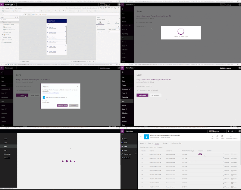
When you are done developing, you have to save and publish the PowerApp. After this, the app is live and available in several applications, such as Power BI and Microsoft Teams.

PowerApps Studio - Publishing the PowerApp


Note:
After saving and publishing your PowerApp it can happen that the PowerApp is missing the Power BI data the next time you open it. To fix this, go to the Power BI service and add a new Power Apps custom visual in the report. Select the right columns (in PowerApps Data) and click on Choose app. Add your existing app and go to the PowerApps Studio. Now your PowerApp is working again, including the Power BI data.

3) Result
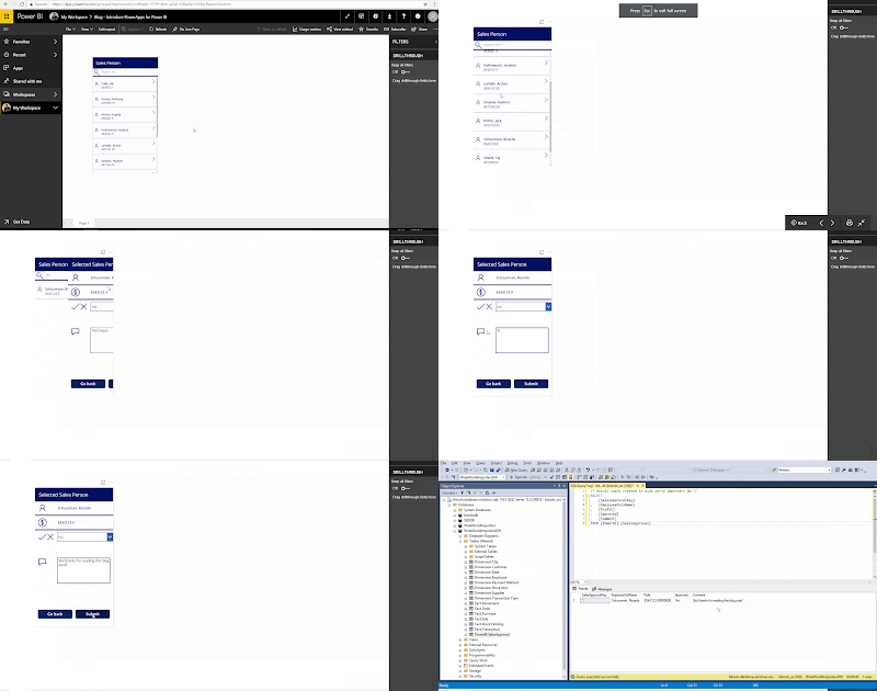
Let's see if we can use this PowerApp in Power BI and store the result in the table "SalesApproval" we created earlier. Go to the Power BI service and open the report. Search for the right sales person (this is you as sales person if this dashboard is live) and fill in the form:
Yes or No for approval and associated comment (Text input). Press Submit when you are done.

Now if we look at the table in SQL Server Management, we see a new record containing the data we have filled in. Cool!

Power BI Service - Submit data in PowerApp (custom visual) and result


You can download the Power BI report here and the first version of the corresponding PowerApp we used for this post here. Use the Export (preview) and Import (preview) feature to add the app in your environment.

Note:
The Export and Import feature is still in preview. After preview, you must have PowerApps Plan 2 trial or PowerApps Plan 2 paid license for this feature.

Summary
In this post you saw how to use the PowerApps custom visual in Power BI. For this example we used PowerApps to approve (or not) a sales report and store this data in an Azure SQL Database.

In a next post we will describe and explain how this PowerApp is build. We will also customize the app to make it more user friendly.

Monday 4 June 2018

Execute Logic Apps in Azure Data Factory (V2)

Case
In an earlier post, we showed you how to use Azure Logic Apps for extracting email attachments without programming skills. The attachments contain the source files. Because this step is part of an Data Warehouse solution, it would be nice to run this together with the ETL process that needs these source files. How can we archive this?

Azure Data Factory V2 - Execute Azure Logic App


Solution
In the first few years of Azure, it was not possible to run your Data Warehouse process entirely in the Cloud. Of course, you could store the data in Azure SQL Database or Azure SQL Data Warehouse (see here for the differences between these two), but when you are using SQL Server Integration Services (SSIS) you still had to run this on-premise or create a custom Virtual Machine. Until recently. This post explains how you can execute SQL Server Integration Services (SSIS) packages in Azure, using Azure Data Factory (ADF) V2.

Besides running SSIS packages in ADF V2, you can also execute other Azure services in here. For example: Azure Databricks, Azure Data Lake Analytics (U-SQL scripts) and HDInsight (services like Hadoop, Spark, Hive etc.).

This post shows you how to execute an Azure Logic App inside ADF V2.

1) Add and configure activity
Create a new pipeline or edit an existing one. Select "General" and choose the Web activity. Give it a suitable name and go to Settings. Fill in the URL, corresponding to the one inside the HTTP trigger in the Azure Logic App, you created earlier:

Azure Logic App - URL in HTTP Trigger


Select the "POST" API Method. Now add a Header and enter the following:
  • KEY: Content-Type
  • VALUE: application/json
When you are finished, click Publish All.

Azure Data Factory V2 - Configure Web Activity


NOTE:
Nowadays the Body is also mandatory, enter the following: @concat('{','}')

2) Run pipeline
After you have published your pipeline, go to Trigger and select Trigger (Now). You can also run the pipeline without publishing it: using Debug. In this mode you will see the result of the pipeline run in the bottom at Output.

NOTE:
If you do not publish your pipeline, you are getting the following error when you are trying to use Trigger (Now):

Pipeline Error - Use Trigger (now) without publishing


NOTE 2:
If you do not publish your pipeline, you are getting the following warning when you want to access the monitor screen:

Pipeline Warning - Go to Monitor without publishing


3) Result
Once you have triggered the pipeline, go to Monitor on the left in the menu. Default it will open the Pipeline Runs overview, but you can also select the Integration Runtimes or Trigger Runs overview at the top.

You can also watch the Runs history of the Logic App:


View Result - Logic App run history


Summary
This post explains how you can manage other ETL, next to SSIS, in your Data Warehouse using one orchestrator. In this case we execute an Azure Logic App using Azure Data Factory (V2).

Click here to see how you can also execute a SSIS package using Azure Logic Apps.

Friday 27 April 2018

Runbook with ADF: Method not found

Case
A little over two weeks ago we created a new Azure Automation account with a PowerShell runbook to pause and resume the ADF Integration Runtime, but got a strange error when running the script:
Method not found


Get-AzureRmDataFactoryV2IntegrationRuntime: Method not found: 'Newtonsoft.Json.Serialization.IAtrributeProvider Newtonsoft.Json.Serialization.JsonProperty.get_Attribute()'.

Of course the script did work before so what had changed since the last time?

Solution
One of the steps to get the pause and resume script working, is to add assemblies for Azure Data Factory (AzureRM.DataFactoryV2) and Azure Profile (AzureRM.profile). Both where updated on April 10. The ADF assembly from 0.5.2 to 0.5.3 and Profile from 4.5.0 to 4.6.0.

Apparently there is a bug: The updated AzureRM.profile assembly requires a newer version of Newtonsoft.Json which is not yet available on Azure Automation. This means the script will work on your local machine, but not yet in Azure Automation. Microsoft is working on an update.

Meanwhile you can use the following temporally workaround: use the previous version of both assemblies. First remove the two new assemblies from your Azure Automation account and then go to AzureRM.profile. Scroll down to the Version History list and click in the previous version. Then hit the Deploy to Azure Automation button.
Deploy to Azure Automation


You will be redirected to the Azure portal where you must select the Automation account to deploy the previous version of the assembly. Select the correct Automation account and click on the OK button.
Select Automation account


Repeat this for AzureRM.DataFactoryV2 and then you are good to go.

Summary
There is a bug on which Microsoft is already working. In the meantime just downgrade to the previous versions or wait for an update.

Saturday 31 March 2018

Use Logic Apps for extracting Email Attachments

Case
Sometimes it happens that source files are delivered via email. In that case you could extract these files with for example a Script Task in SQL Server Integration Services (SSIS) or a PowerShell Script, but this requires some serious programming in C#, VB.net or PowerShell . Are there other and easier ways to get email attachments without programming skills?

Azure Logic Apps - Codeless and serverless


Solution
As we slowly move from on-premises Data Warehouses (DWH) to Azure, we could use other Azure parts to solve this: Azure Logic Apps. With this, you can build automatic workflows without writing code in C# or other programming languages. For example, extract social media data like Twitter tweets or using it for Azure Data Factory V2 notifications. For a lot of BI specialist writing code can be a threshold, so this service offers a way out. We will store these email attachments in Blob Storage. After that, you can load these files into your DWH using SSIS for example.

Starting point of this post is an existing storage account and blob container.

1) Create new Logic App
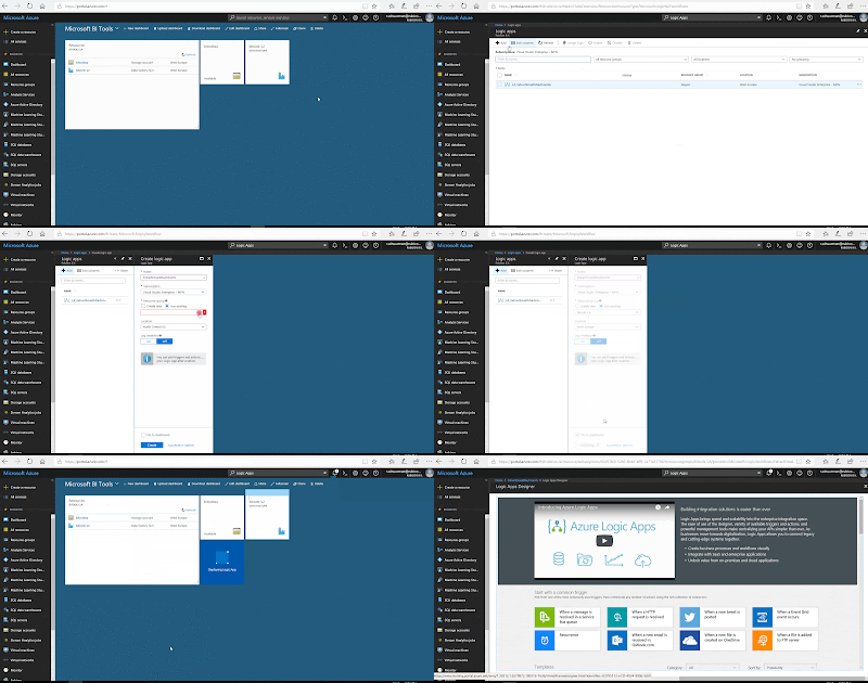
Go to your Azure portal and type in "Logic Apps" in the search bar Search resources, services and docs. Locate Logic App under Services and click on Add. Give it a suitable name like "ExtractEmailAttachments" and then choose the Subscription, Resource Group and Location. For the Resource Group and this Logic app we use West Europe since we are from the Netherlands.

Azure Portal - Create Logic App


2) Add trigger
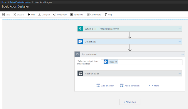
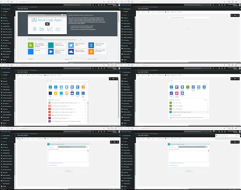
When editing the Logic App, we first need to pick a trigger. It is the event that starts this Logic App. In this case, using Azure Data Factory, we pick the HTTP trigger When a HTTP request is received


Logic Apps Designer - Add HTTP trigger


NOTE:
When you open the Logic App for the first time, you can choose several (common) triggers. You can also choose existing Logic Apps templates for known applications or purposes to use it as an example or starting point. 

3) Get emails
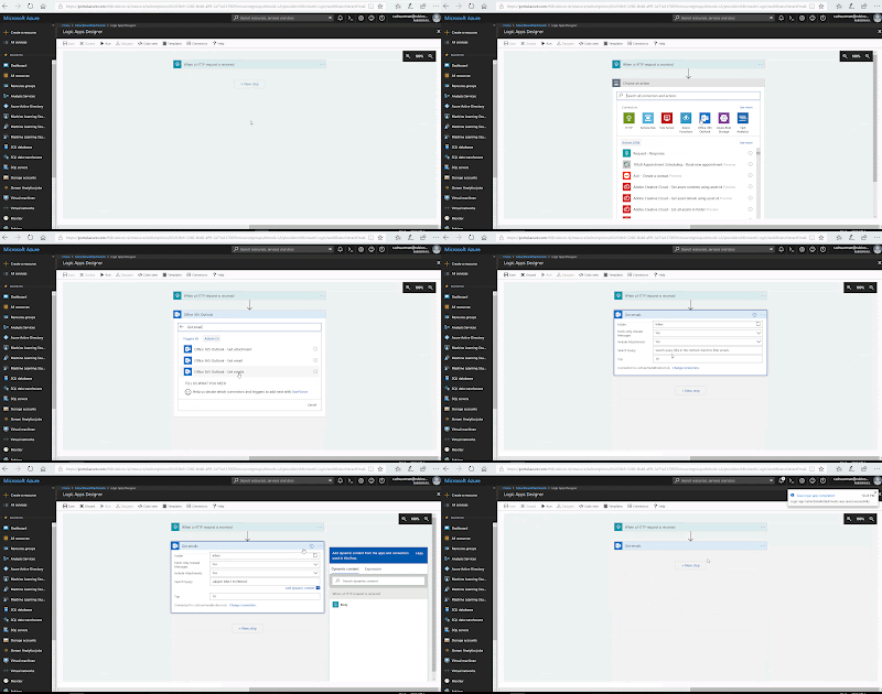
Next step is to retrieve the emails. Click on New step and Add an action. Choose the Connector "Office 365 Outlook", search for "Get email" and select Office 365 Outlook - Get emails. The first time that you use this action, you need to login with your Office 365 account. Now you setup this action by choosing the Outlook folder, select only unread messages including the attachments and what subject the email contains (like in the Outlook client). Click on Save in the upper left corner when you are finished.

Logic Apps Designer - Add action Get Emails


4) Filter emails
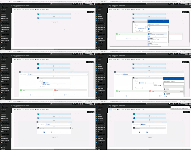
In this scenario we are receiving various source files per email each day, but we first want to retrieve attachments from emails with a specific subject and store those in a separate blob storage container. For other email subjects we can add more conditions and save all those files in there own blob storage containers. That's why we are looping through the inbox (or another Outlook folder) and filter per subject. Add a new step and choose Add a condition to filter on a specific source file. Now automatically the for each will appear, because we are receiving multiple emails in the previous step. Give the condition a suitable name, because you have to add more conditions to separate the different source files (we only show one condition in this post).

Logic Apps Designer - Add condition


5) Store data in blobs
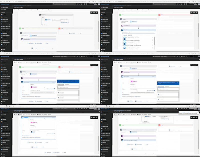
Now that we have filtered the emails per subject, we must store the attachment (which contains the data) itself. Add an action on the 'if true' side and choose "Azure Blob Storage". Inside this category, choose Azure Blob Storage - Create blob. The first time that you use this action, you need to create a connection. Choose the storage account and give the connection a suitable name. Now you can setup this action by defining the Folder path, Blob name and Blob content. As said earlier, we are retrieving new source files every day. That's why the blob name will contain the day of load. This is the expression:
concat('DWH01_Sales_',
formatDatetime(utcNow(),'yyyy'), '-', formatDatetime(utcNow(),'MM'), '-',
formatDatetime(utcNow(),'dd'),'.csv')

Logic Apps Designer - Create blob


NOTE:
There is no separate action to create a new folder in the Blob Storage container, but it will be created automatically when you save the first file in the container.

6) Send email when succeeded
Every time the data is stored into a new blob, we will confirm this by sending an email. In this case, we will send the email to the same account as step 2 (Get Emails). You can of course send it to developers or administrators in your organization as well. In that case you must create a new connection by clicking change connection, because now this action will automatically use the same Office 365 connection as before. Insert a new step and select "Office 365 Outlook" and choose the action Office 365 Outlook - Send an email. We create the following Body:

Dear User,

The run of DWH01_Sales has completed successfully for March 31, 2018.

Kind regards,
Azure Logic Apps

Therefore we need to use the following expression:
concat('The run of DWH01_Sales has completed successfully for '
, formatDatetime(utcNow(),'MMMMM'), ' ', formatDatetime(utcNow(),'dd'), ', '
, formatDatetime(utcNow(),'yyyy'), '.')

Fill in the Subject and select "To" to send the email To the account used in the Office 365 connection.
Logic Apps Designer - Send email


7) Mark email as read
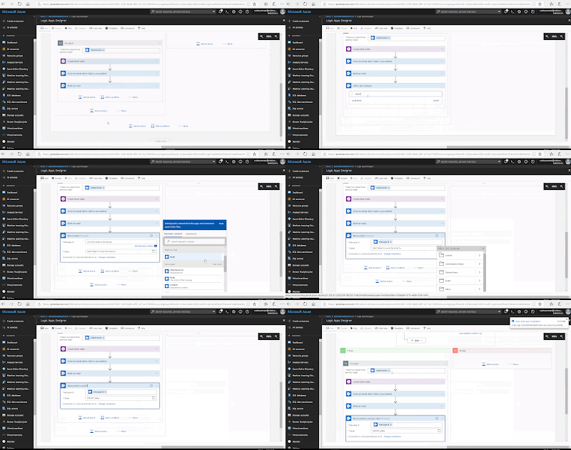
After we have sent the succeed email, we want to mark the processed emails (Daily Schedule) as read. Insert a new step and select "Office 365 Outlook" and choose the action Office 365 Outlook - Mark as read. Click on Message Id  and choose "Message Id", based on step 2 (Get Emails). You have to click on "See more" to make it appear in the list.

Logic Apps Designer - Mark as read


8) Move email to archive
Finally, we will move the emails to an archive folder. We created separate mail folders in Outlook for each subject/source file. Insert a new step and select "Office 365 Outlook" and choose the action Office 365 Outlook - Send an email. Choose the Message Id  and select the specific sub Folder in archive.


Logic Apps Designer - Move email


Result
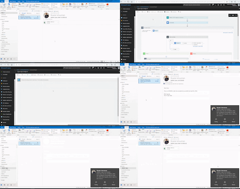
Now let's see if it all works. Make sure you have sent the email "DWH01_Sales DAILY SCHEDULE" and it is unread. Click in the Logic Apps Designer on Run. Now wait for the succeeded email...it works!


Result - Received succeeded email


The source file is also stored into a new blob. See below the result in Azure Storage Explorer.

Result - File stored as new blob


Summary
In this post we showed you how to build a Logic App to ingest email attachments as source files. All without programming skills and easily to maintain easily as part from an ETL process.

Click here to see how to execute this Logic App with Azure Data Factory V2 as part of an DWH solution in Azure.

This is why we started the Logic App with an HTTP trigger that can be called from other applications. If you do not want to integrate the Logic App and use it as a separate solution, then you should start with a different trigger. For example a Recurrence trigger or When a new email arrives

Thursday 25 January 2018

Power BI - Bookmarking feature update (December 2017)

Case
In an earlier post we explained and showed you how to use the new bookmarking feature (October 2017 update) through an example combining a chart and related information of this chart. Besides that, you can also use bookmarks to switch between two charts in the same area in your report page. Unfortunately, this had its limitations: passing filters and multiple toggles. What has changed in the bookmarking functionality that makes it more user-friendly to use?

Bookmark updates December 2017


Old situation
Shortly after the release in October, we implemented bookmarks at our customer. We used two different charts in the same area in a report page to let our users look at the data from two perspectives, without making a new page or report. This is one of the great benefits of using bookmarking.

Unfortunately we quickly realize that this is a nice added functionality, but still has its limitations. In this post we will show you two examples: the passing of selected filters to another bookmark and multiple toggle buttons in one page.

Example 1: passing of selected filters
The selected filter in one bookmark doesn't work on the other bookmark when you switch from chart. If you select year 2016 in the first bookmark (with the first chart) and clicking on the button for the other bookmark (the second chart), the second chart will show all the data instead of only 2016.

Old - Filters not applying other bookmarks


Example 2: multiple toggle buttons
Multiple buttons in one report page to switch between charts doesn't work. When you have two toggle buttons (left and right area) where you want to switch charts: clicking toggle button number two on the right also effects the button (and the chart) on the left.

Old - Multiple toggle buttons doesn't work


Solution
As mentioned before, there are some updates related to the bookmark feature. These will solve the two examples in the old situation we described earlier. With this update, they also give you the ability to create a bookmark with a cross-highlighting state of your report. Before, cross-highlighting was not included as part of a bookmark and you could only save the entire state of a report (without selected filters, selected bar in a chart etc.). Now everything that is in your report can be saved as a part of a bookmark.

For now we will focus on solving the problems in the two examples described earlier about filtering and multiple toggle buttons in one report page.

Create the Report (images)
First, make sure you have the latest Power BI Desktop version. If you are using Power BI Desktop from the Microsoft Store, it updates automatically. Otherwise you can download the latest version of Power BI Desktop here.

The starting point in both reports is the same report from an earlier post. In example 1 we created a new chart on the same spot in the left corner of the chart 'Total Sales and Profit per Month'. We added a toggle button above the chart where you can switch between those two charts. In example 2 on a new report page we also added a new chart on in the right upper corner of the chart 'Total Sales and Profit per State'. We also use a toggle button here. Now we have have two toggle buttons on the same report page.

We created the toggle buttons by our own using Google images and then customized them with Paint.NET. For the text before the buttons, we used the custom visual 'Long Text Viewer'. You can download it here (it is not available in the store).

Result example 1
With this update you now have three categories of types of stuff to save in a bookmark: data (slicers, filters, cross-highlighting etc.), display (hiding visual, spotlight etc.) and current page (which page is related to the bookmark). You can turn these categories on and off by the settings of a bookmark.

New - Turn items on and off


To fix the problem from example 1, you have to uncheck the data category for both bookmarks (charts) which are involved with the toggle button. Now it only effects the buttons and the charts.

New - Selected filters effects other bookmark


Result example 2
Besides those new three categories, there is another option available: Selected Visuals (default is All Visuals). You will find this option below the categories.

New - Selected visuals

To fix the problem from example 2, we use this Selected Visuals. As said before, by default it will bookmark the entire page, but now you can select the visuals (charts, buttons etc.) that you want to include in the bookmark. First, we select all the visuals related to the left toggle button (black and off). You need to repeat this for the left toggle button, but now for all the visuals when this button is on (grey). Repeat this for the toggle button on the right and by the end there are four bookmarks. Do not forget to configure 'Link' in each bookmark for making both buttons work. Finally, select Selected Visuals for all those four bookmarks. To be clear: it seems simple, but it is meticulous work!

Below you will find the making of this solution.


NOTE:
By creating a bookmark with Selected Visuals, note the following:
  • Make sure you do not have a bookmark selected when creating a new one. Otherwise it will overwrite this bookmark with the new selected visuals. You can only deselect the bookmark by making an image visible/hidden.
  • After creating the bookmark with selected visuals, you cannot see which visuals are related to this bookmark. They are no longer marked in gray. 
  • You cannot give the visuals a name. In case of multiple toggle buttons you have at least four times a visual called 'image'. By place them in order you can distinguish them.  
You can download the entire Power BI report with all the examples here.

Conclusion
In this post you saw how the new updates related to the bookmark feature gives you more flexibility to creating bookmarks. Not all the technical changes are difficult (check or uncheck), but this is a huge update that will eliminates uncertainties and confusion among our users.

Unfortunately, there are still some updates needed to make it more user friendly to build/maintain the bookmarks. For example the opportunity to give the visuals a name or show which visuals are related to a bookmark (in case of selected visuals).

If you want more information about creating bookmarks in the first place (the basic), click here.

Monday 16 October 2017

Power BI - Use Bookmarks for Chart information

Case
Do you also regularly get the question from customers about which data the chart shows and what the definitions are of this data? I do. The October update from Power BI Desktop includes Bookmarks (preview). How can you use bookmarks in your dashboard to answer those questions in a user friendly way?

Bookmarks in Power BI 


Solution
Bookmarks enables you to save interesting states of your report. A state can be saved inside your report as a bookmark. These bookmarks can be helpful to tell a story to a customer (like a PowerPoint presentation) and allow you to navigate through the report or to store important analyzes. You can also use a state (bookmark) to use two different visuals for the same data, for example a table and a column chart. Using a button (self-made images), you can switch from visual. In this post we will show you how to combine a chart and related information using bookmarks.

Before we get started, it is important to know that Power BI Desktop is now available in the Windows Store. If you install this via the Windows Store, your Power BI Desktop will always be up to date and you no longer have to manually download and install a new version every month. A big advantage.

Windows Store - Power BI Desktop


1) Create the Report (images)
First, make sure you have turned on the preview feature 'Bookmarks' in the menu. Go to Options and settings and click on Options. On the left (Global) you see Preview features, click on this. Select the bookmark feature and save your settings. You may have to restart Power BI Desktop.

Power BI Desktop - Turn on preview features


We use the same report from an earlier post. In this report, we have four visuals and three of them are charts. We want to show some information about the chart 'Total Sales and Profit per Month' in the upper left corner.

First, we insert a self made black question mark image to the upper right corner of the chart. This will be default look of the report (and will be the first bookmark later on). Now we want to show the information of the chart. Therefore we insert another question mark image on the same spot, a gray one. The black question mark is not visible anymore. Last, we insert a text box on the same spot as the chart. The chart will not be visible now. This text box contains information about the report and you can also add a link for additional information. The report now shows us information about the chart (screenshot 2).

Power BI Desktop - Add all the visuals to the report


2) Create the Bookmarks
We want to create interaction between those two states, because now only the last visuals (with information about the chart) are visible in the report. For this we need the bookmarks.

The first bookmark is the state of the original report, with the chart. Note that this state has a black question mark. For this bookmark, we have to hide the other visuals. In this case, the gray question mark image and the text box with information. Go to the 'View' menu and select the 'Selection Pane'. On the right side the 'Selection' pane will appear. Deselect the gray question mark image and text box in 'Selection'. Now we see the first original state again. We want to save this state by adding a bookmark. Go to 'View' and select the 'Bookmarks Pane'. On the right the 'Bookmarks' pane appears. Click on 'Add' and give the bookmark a suitable name.

The second bookmark must contain the information about the chart. Open the 'Selection Pane' again make the gray question mark image and text box visible again. Now hide the chart 'Total Sales and Profit per Month' and the black question mark image. Save this as a new bookmark.

Finally, when we click on the black question mark, we must ensure that we will be redirected to the information state and then back to the default state (by clicking the gray question mark). Click on the first bookmark called 'Home (overview)' and select black question mark image. you see a new option called 'Link'. Turn this on, choose 'Bookmark' as type and select the bookmark 'Chart 1 information (selected)'. Now select the second bookmark and follow the same steps, but now you select the gray question mark and you link this image to the first bookmark 'Home (overview)'.

Power BI Desktop - Create the bookmarks


NOTE:
First, you have to create all the visuals in your report and then you can create bookmarks in combination with the selection pane to show or hide those visuals for a specific bookmark. Otherwise, when you first create a bookmark of the original state and then add new visuals for the second bookmark, the first bookmark will also inherit those new visuals.

3) Result
We will now watch the result in the Power BI service. Open the published report and click on the black question mark. The information about the chart is now displayed instead of the chart it self. A new click on the gray question mark will bring you back to the original report with the chart. It works!

Power BI Service - Result

Bookmarks View
There is a new feature in the 'View' menu, the 'Bookmarks pane'. It is below the already existing 'Selection pane'. Turn this feature on and the 'Bookmarks' pane appears on the right. Click on 'View' in 'Bookmarks' and you will see a Bookmark bar below. In this bar you can switch between the bookmarks. Enter the full screen mode and it looks like a PowerPoint presentation with different slides. Cool!

Power BI Service - Bookmarks View


Power BI Desktop
You can also open the bookmarks view in Power BI Desktop to make sure it works before publish the report. Open the 'Bookmarks pane' as before and click on the same 'View' button. It works the same as in the Power BI service.

You can download the Power BI report here.

Conclusion
In this post you saw how to customize your dashboard using bookmarks. This is one of the many ways to use them, besides presentation or storing important analyzes. With this, you do not have to refer your users to another location for associated documentation. Also, what I see in practice as well, an information page (sort of landings page) is not necessary anymore.

Since this is a preview, there will be more features in the next versions. This post describes the updates and improvements related to the bookmarking feature, released in December 2017.